Responsive Web Development
Seamless Across Devices, Uncompromising in Experience
Overview
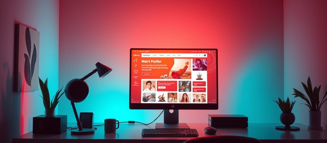
Your website should look and function flawlessly on any screen, whether it’s a widescreen desktop, a tablet, or a mobile phone. At Wazuri WebCraft, we don’t just make websites “mobile-friendly”—we craft fully responsive digital experiences that adapt seamlessly across all devices without compromising design integrity or functionality.
While many web developers create separate mobile experiences that strip away key design elements, we take a different approach. Our philosophy is simple: the same design, the same theme, the same experience—optimized for every screen size.
Why Responsive Web Development Matters
- Consistency Across Devices – Users shouldn’t have a fragmented experience when switching between desktop and mobile. We ensure your brand identity and website functionality remain consistent across all screens.
- No Stripped-Down Mobile Sites – Many mobile designs compromise features, layouts, and user experience. We maintain the full integrity of your site’s design while making it adaptable for different resolutions.
- Optimized for Performance – Our responsive designs load fast, adjust fluidly, and ensure smooth interactions without bloated code slowing things down.
Our Process
1️⃣ Planning & Strategy
- We assess your brand identity and user behavior to determine the best responsive approach.
- Strategic layout planning ensures all key content elements are preserved across screen sizes.
2️⃣ Design & Development
- We use fluid grids, flexible images, and scalable typography to ensure a seamless user experience.
- Adaptive navigation guarantees that menus, buttons, and touch interactions work flawlessly on smaller screens.
3️⃣ Testing & Optimization
- Cross-device testing ensures your website performs consistently on desktops, tablets, and mobile devices.
- Performance tuning guarantees fast load times without sacrificing quality or functionality.
Beyond Mobile-Friendly: Future-Proofed Design
Our responsive web development approach isn’t just about working well on today’s devices—it’s about ensuring your site remains adaptable as new devices and resolutions emerge. Whether it’s a laptop, an ultra-wide monitor, or a foldable smartphone, your website will always display beautifully.
Looking for More? We Can Also:
✅ Develop Progressive Web Apps (PWAs) for a mobile app-like experience.
✅ Enhance accessibility and usability to make your site intuitive for all users.
✅ Integrate e-commerce and interactive elements that work seamlessly across devices.
Let’s Build a Future-Proof Website
If you want a website that delivers a flawless experience everywhere, without compromises, Wazuri WebCraft is ready to make it happen. Let’s build something exceptional together.